
Oh no! You get those fabulous sunset images on to your computer and discover they show a fraction of the vibrance and colour you saw with your naked eye. There are various technical and perceptual reasons for this, but the bottom line is that you need to fix it, and we show you how!
See all 15 instalments
• 15 common photo fixes
Adobe trial downloads
• Download Photoshop
• Download Lightroom
• Download Premiere Pro
Computers and photo editing
• Best photo-editing software
• Best laptops for photographers
• Best desktop computers for photo editing
Photo tips and ideas
• 11 home photo projects
• 44 tips cards to cut out and keep
• Photography tips for beginners
Welcome to the 15th and final instalment in our 15-part series on how to fix common photo problems in Photoshop, Lightroom and Adobe Camera Raw.
With the world in lockdown as we wait for the coronavirus crisis to pass, we need to find new ways to use our time effectively, and learning some new photo-fixing techniques seems a pretty good way of doing that.
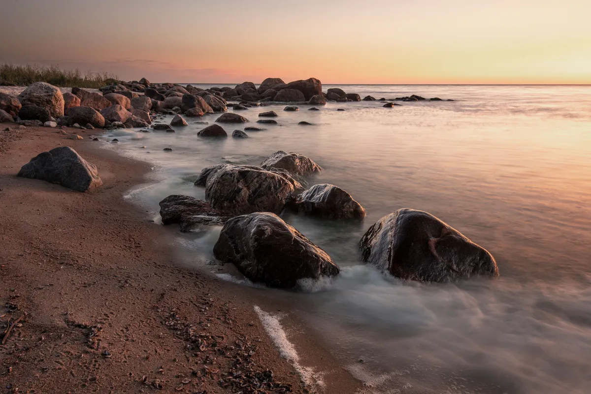
In this instalment we'll look at an issue we've probably all faced at one time or another. We've waited for a beautiful sunset, we've done everything right, our shots are sharp, perfectly exposed and perfectly composed... and yet they just look flat. Where are the colors? Where's the richness? Where's the depth?
Don't have Photoshop? You can get a 7-day Adobe Creative Cloud trial to try Photoshop and other Adobe software for free.
• Download Photoshop
• Download Lightroom
• Download Premiere Pro
This can be down to something technical, like the wrong choice of white balance. You will typically get dull sunsets when the camera is set to Auto white balance, because it will attempt to neutralize warm sunset tones by selecting an unnaturally cool color temperature.
It can also be caused by the difference between the camera's technically accurate rendition of a scene, and our over-exaggerated perception. Well, the camera may be right, but we still want the scene to look the way we perceived it!
So here are two digital corrections that tackle both of those issues.

1. Get creative with White Balance

Open the image in Adobe Camera Raw/Lightroom and move the Temperature slider to the right to warm the tones. You could also try dragging the Tint slider to the right to introduce magenta. Experiment by pushing further than usual.
2. Use the Channel Mixer

Open the image into Photoshop, then add a Channel Mixer Adjustment Layer. Select the Red channel and set Red +200, Blue -50, Green -50. Then select the Blue channel and set Blue +200, Red -50, Green -50. You'll be amazed at the difference!
Jargon buster
Temperature: This is one of two adjustments used for white balance corrections. It corresponds to the old photographic principle of 'color temperature', where the colors of different light sources are measured on a temperature scale calibrated in degrees Kelvin (K).
Tint: This is a secondary white balance adjustment that was not used in the days of film but is used on today's digital cameras. Where the Temperature slider operates on a yellow-blue spectrum, the Tint slider controls a green-magenta shift. White balance settings typically use a combination of Temperature and Tint values.
Channel Mixer: A tool most often used to combine red, green and blue in different ratios when creating black and white images from color originals. You can also use it on color photos, but here it's a lot more complicated and somewhat counterintuitive, as you adjust the red, green and blue balance for each of the red, green and blue channels. It's easier to show this in action than explain it... but not much!
If you don't use Photoshop or Lightroom, why not sign up for the trial version? You can use this free for a period of 7 days and then decide which of three Photography Plan subscriptions would suit you best.

