Try these FREE tinting treatments to master monochrome in Affinity Photo
Master monochrome in Affinity Photo with classic analogue effects using our 16 free tinting treatments
Watch video: Use our free mono treatments in Affinity Photo
Black-and-white can be a beautiful effect, but sometimes a subtle color tint can elevate things to another level. In this project, we show you how to apply classic tinting effects in Affinity Photo.
From vintage sepia treatments to classy cobalt finishes, we explain how to craft a host of different treatments. And if you’d rather jump straight in and start applying these classic analog finishes to your images, you can download 16 FREE presets ready to be loaded into Affinity Photo and tested on your own photos.
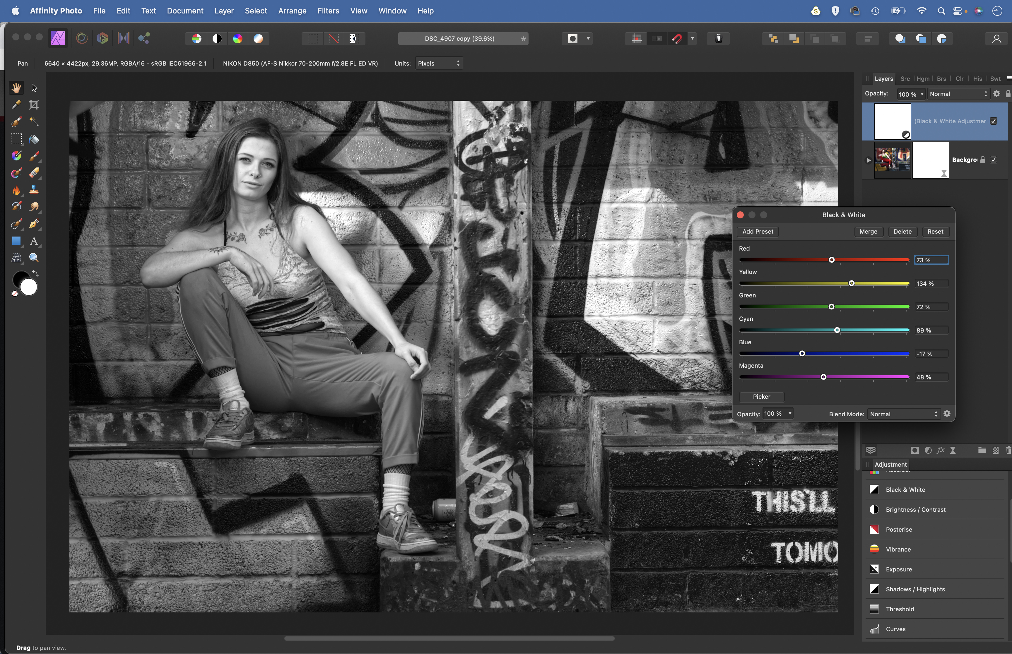
However, the tinting is only half the effect; first you need to know how to convert to mono. Our free presets can do this for you with a standard monochrome treatment, but you have more control over the effect if you do it yourself first and then convert your images to mono with a black-and-white layer, because this enables you to tailor the conversion to the content of your photo.
Here it enables us to push and pull the luminance of the vibrant graffiti in all kinds of different directions. With your own photo, you might want to darken a blue sky or lift a piece of colorful clothing in a similar way.
Once we’ve converted to monochrome, we can then make tinting effects with the Gradient Map Adjustment, which enables us to map colors onto the tonal range of our photos. So, we can tint the shadows one color, the midtones a second, and the highlights a third…
To follow along download the start image here or use one of your own portraits.
The best camera deals, reviews, product advice, and unmissable photography news, direct to your inbox!
1. Convert to mono
Open your image in Affinity Photo, then go to the Layers panel, click the Adjustment icon at the bottom and choose Black And White. Now experiment with the six color sliders. These enable you to change the brightness of color ranges. Tailor the black-and-white effect to the content of the image.
2. Boost the contrast
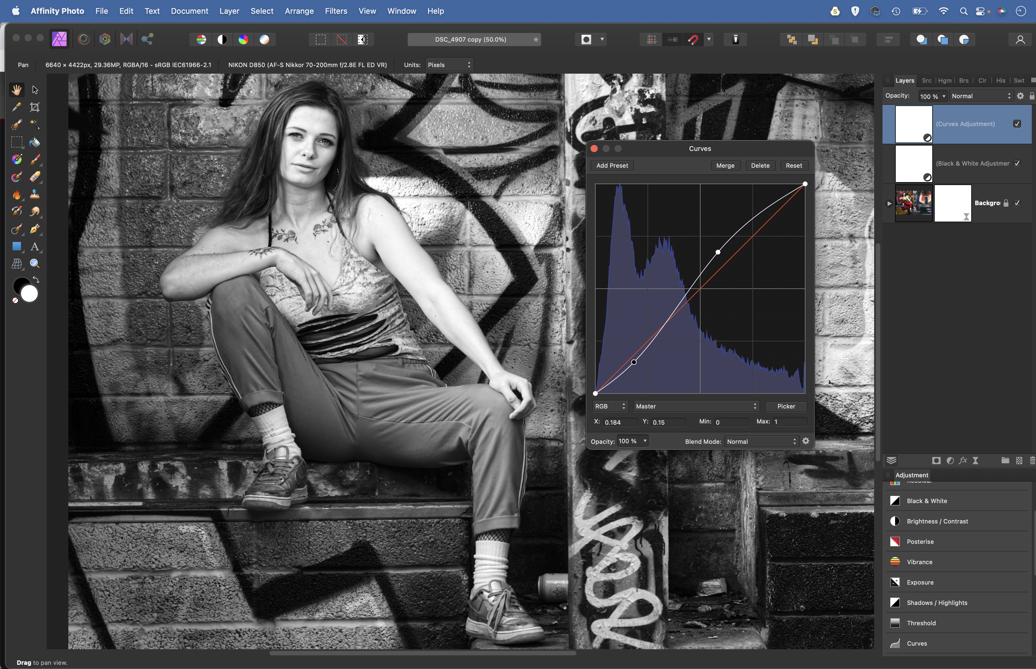
Black-and-white effects can initially look a tad flat, so it’s worth adding contrast with a Curves Adjustment layer. Make a shallow S-shaped curve by dragging one point upwards near the top of the line, and a second point downwards near the bottom. The bigger the S shape, the stronger the contrast.
3. Prepare the gradient
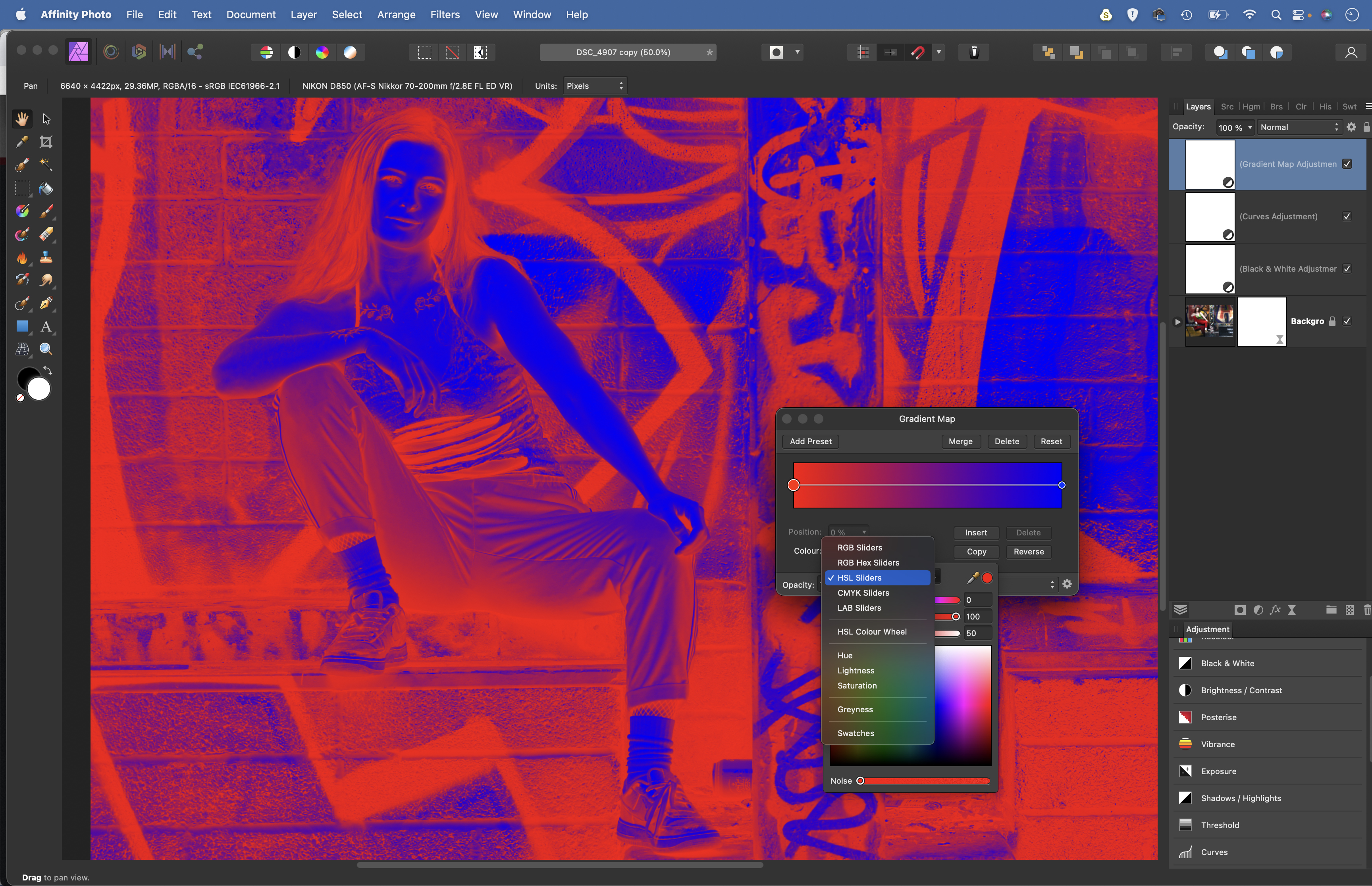
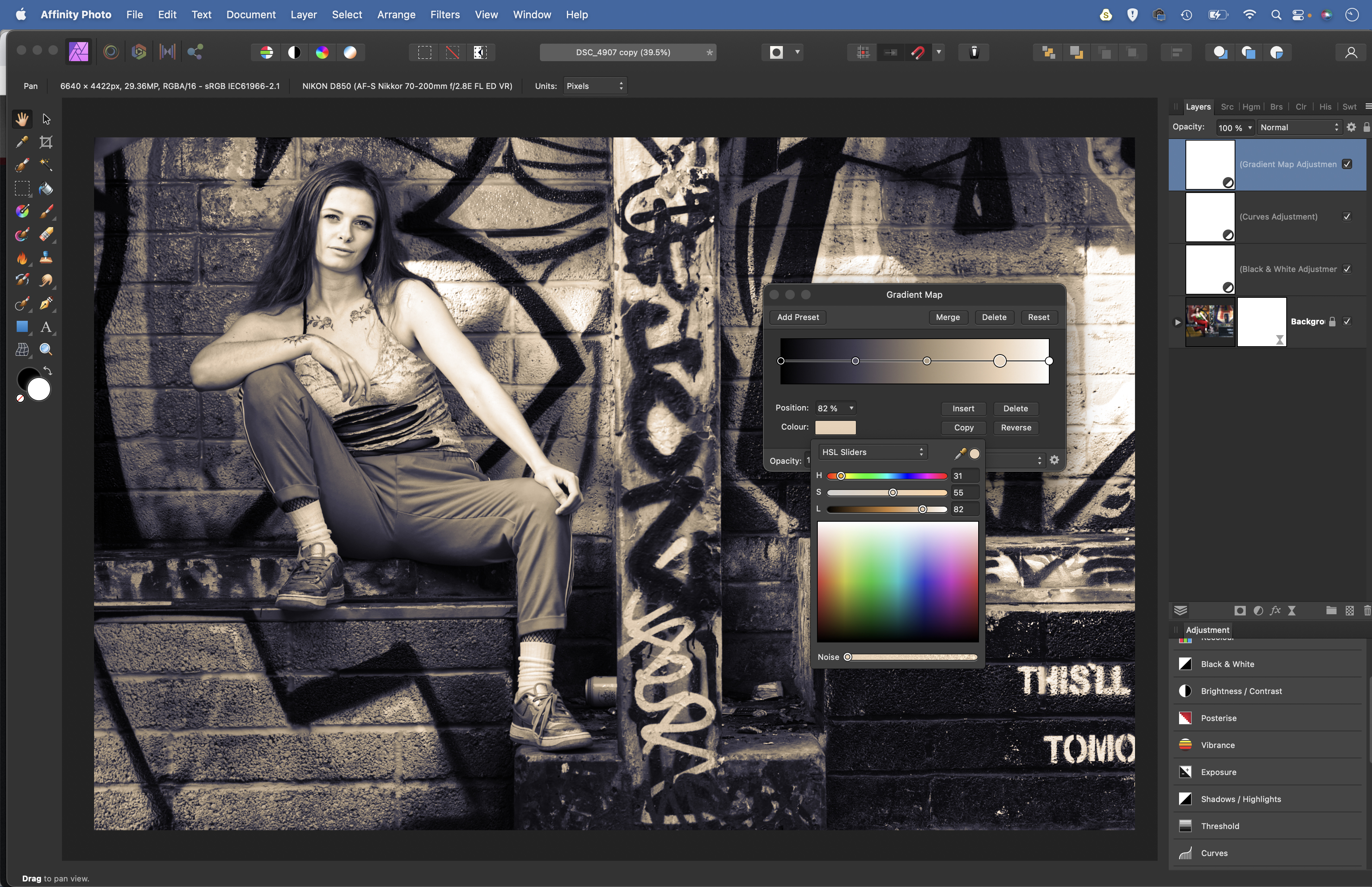
Add a Gradient Map Adjustment layer. Initially, the colors look terrible. Highlight the middle color point and click the Delete button, then highlight the left point. Click the color box. Select HSL Sliders from the color drop-down and set L to 0. Highlight the right point, click the color box and set L to 100.
4. Add colour stops
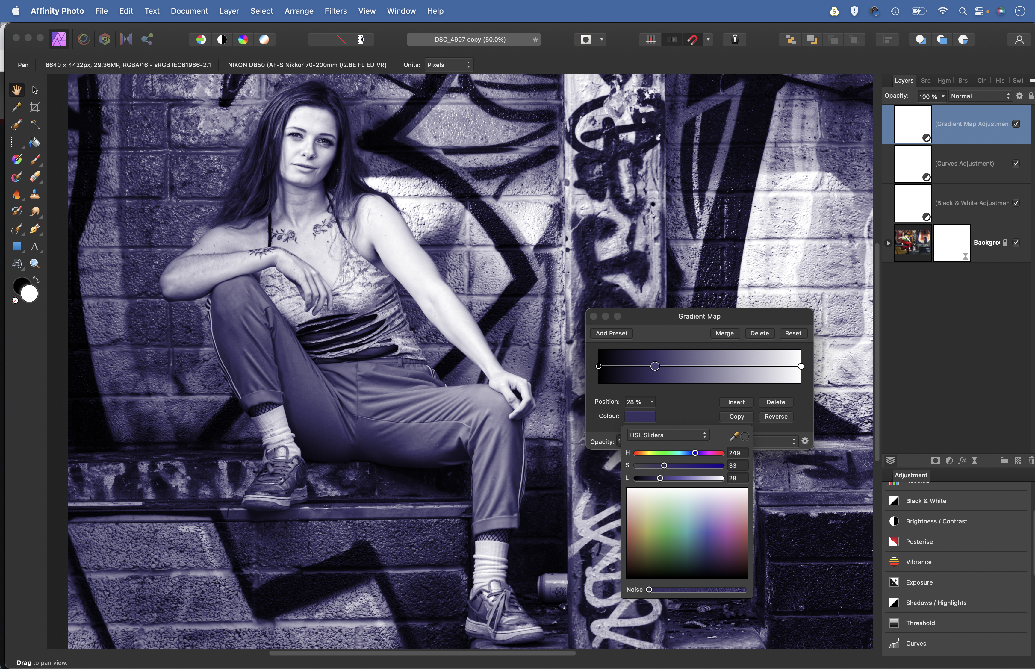
Now our gradient is prepared, we can add color stops along the line. Double-click on the left side and add a point, then adjust the H (Hue) and S (Saturation) sliders. Leave L alone because this alters the luminosity, which can mess things up. Choose a color to tint the shadows.
5. Tint the highlights
Double-click on the line again and make more color stops to tint the midtones and the highlights with any shade you like. Once done, you can fine-tune the overall strength of the color effect by lowering the layer opacity of the Gradient Map layer.
6. Darken the edges
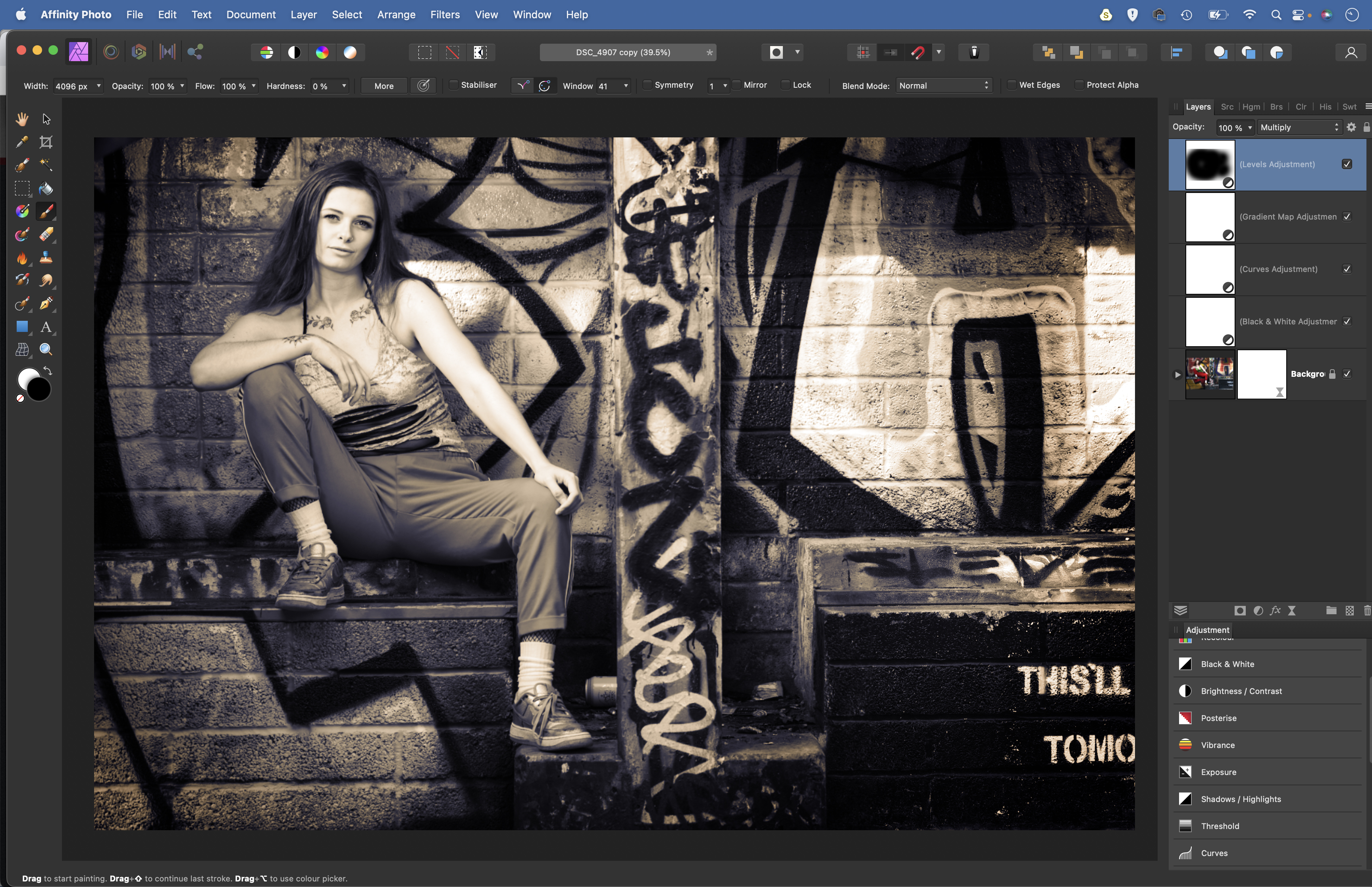
A quick trick can darken the edges of the frame. Add a Levels Adjustment layer and change the Blend Mode to Multiply. This darkens the whole image. Grab the Brush tool, set hardness to 0 and color to black, then paint to hide the darkening effect over the subject.
• See more of our Affinity Photo tutorials
PhotoPlus: The Canon Magazine is the world's only monthly newsstand title that's 100% devoted to Canon, so you can be sure the magazine is completely relevant to your system.
If you enjoyed this tutorial but want a bit more power from your laptop, why not look at the best photo-editing laptops? If you're really keen to improve your skills further than online photography courses could be the way to go.
The lead technique writer on Digital Camera Magazine, PhotoPlus: The Canon Magazine and N-Photo: The Nikon Magazine, James is a fantastic general practice photographer with an enviable array of skills across every genre of photography.
Whether it's flash photography techniques like stroboscopic portraits, astrophotography projects like photographing the Northern Lights, or turning sound into art by making paint dance on a set of speakers, James' tutorials and projects are as creative as they are enjoyable.
He's also a wizard at the dark arts of Photoshop, Lightroom and Affinity Photo, and is capable of some genuine black magic in the digital darkroom, making him one of the leading authorities on photo editing software and techniques.
