Lightroom hack #14: Black and white toning with Color Grading
If you like toning your black and white images you may wonder where Lightroom’s Toning panel actually went

The best camera deals, reviews, product advice, and unmissable photography news, direct to your inbox!
You are now subscribed
Your newsletter sign-up was successful
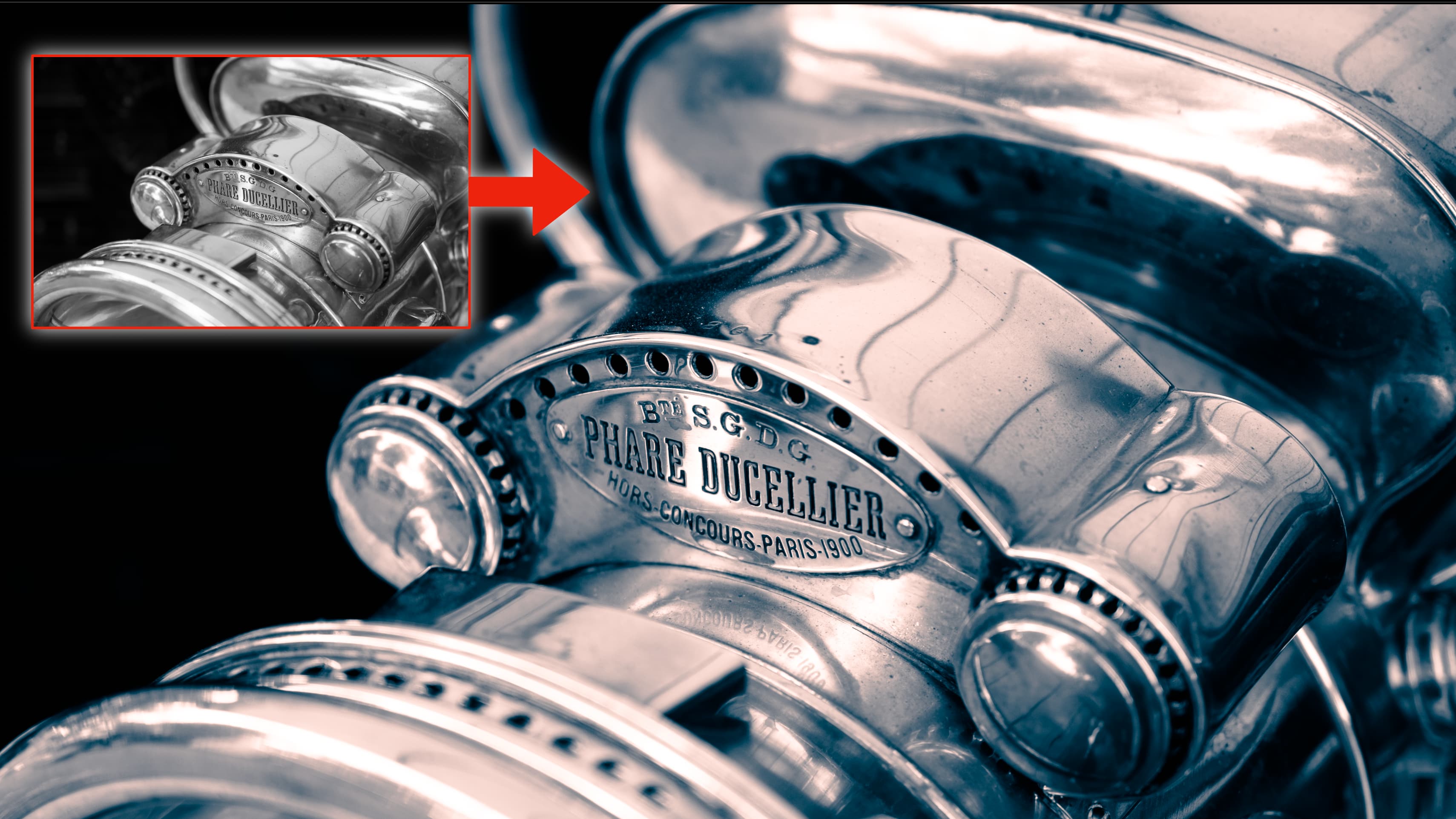
You can add a great deal of richness and depth to black and white images with toning. You can also wreck them completely, as most in-camera sepia modes demonstrate all too well.
We are publishing one hack a day this New Year holiday period, see our other Lightroom Hacks
So where exactly ARE the toning options in Lightroom? There used to be a Toning panel, which then got replaced with a Split Toning panel and now that’s gone too, replaced with the Color Grading panel.
It sounds as if Adobe is chopping up the tonal range into smaller and smaller sections for individual treatment and that by calling it ‘Color Grading’ it’s leaning more towards color and video work.
But black and white photography fans needn’t worry because the Color Grading panel works just as well for black and white toning – all you need to do first is swap your image to Black and White mode in the Basic panel.
The Color Grading panel is more complicated than the Split Toning and Toning options before it, but it can still give great looking single tone and split tone effects.
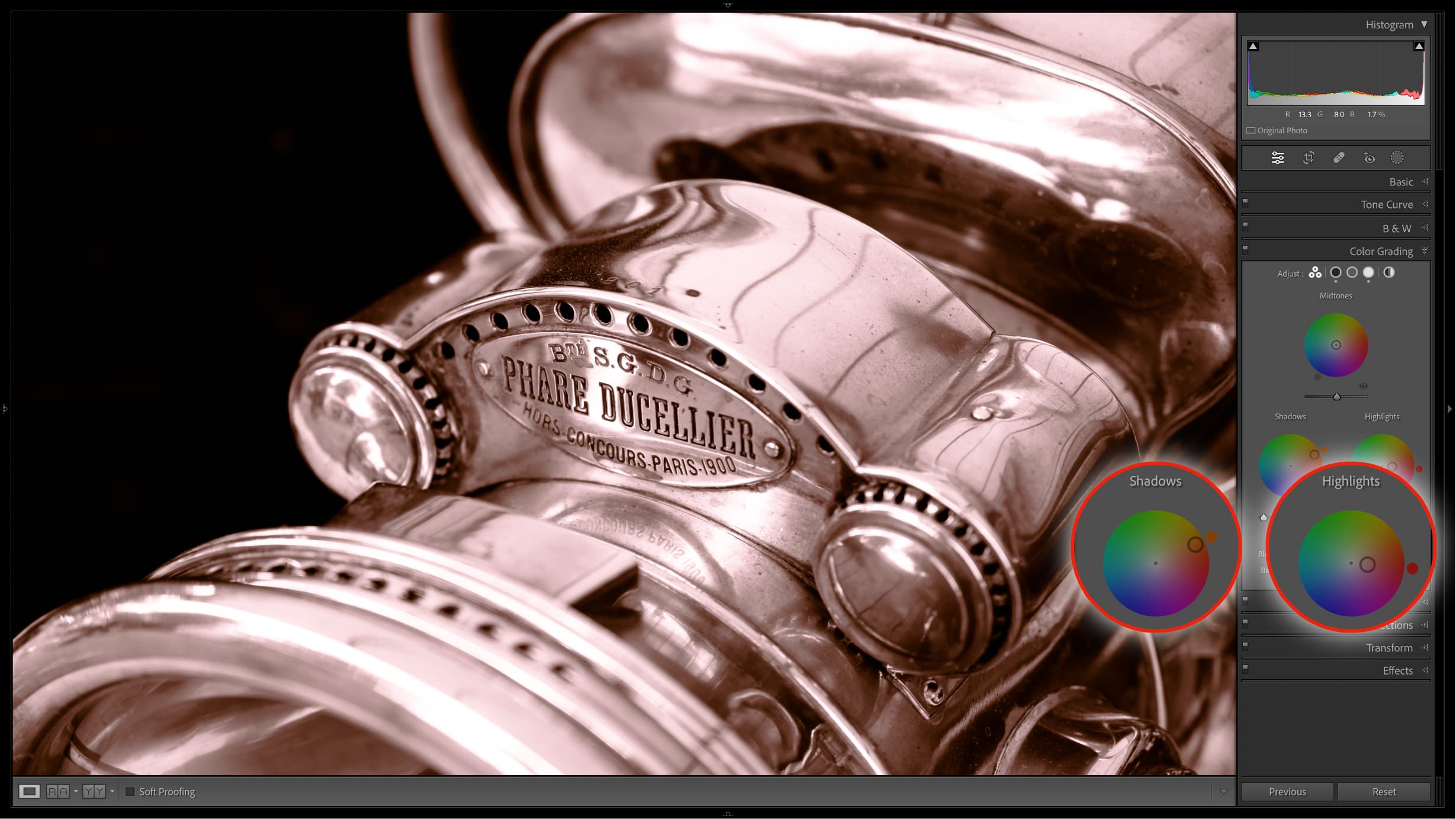
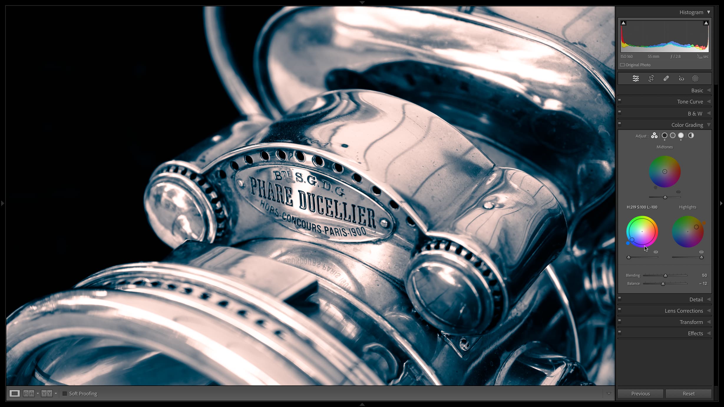
It splits the image up into Shadows, Midtones and Highlights, each with its own color wheel. You can work on them individually or all at once as I usually do.
For single-toning I would just edit the shadows. I think toning works best in shadow areas and not across the whole tonal range. For this, drag the control point out from the center of the color wheel and towards your chosen toning color. The further you drag it towards the edge, the stronger the color. You can change the color by dragging the little gadget around the circumference of the wheel.
The best camera deals, reviews, product advice, and unmissable photography news, direct to your inbox!
Finding two colors that work together well for split toning is trickier, and one approach is to choose the same or similar colors for both shadow and highlight toning (I generally leave the midtones alone.)
In my opinion, successful split toning combinations are few and far between, but blue shadows and brown highlights can work quite well. Underneath each color wheel is a brightness slider, and this can be useful for adding depth, especially in the shadows.
At the bottom of the panel are Blending and Balance sliders. The Balance slider can be useful for balancing shadow and highlight tones.
For black and white photographers, calling this the Color Grading panel is about as counter-intuitive as you can get, but do rest assured – this panel will let you tone or split-tone your images with all the control you could ask for.
Read more:
• Best photo editing software
• Lightroom review
• Lightroom Classic review

Rod is an independent photography journalist and editor, and a long-standing Digital Camera World contributor, having previously worked as Group Reviews Editor, Head of Testing for the photography division, Technique Editor on N-Photo, and Camera Channel editor on TechRadar, as well as contributing to many other publications.
He has been writing about digital cameras since they first appeared, and before that began his career writing about film photography. He has used and reviewed practically every interchangeable lens camera launched in the past 20 years, from entry-level DSLRs to medium format cameras.
Rod has his own camera gear blog at fotovolo.com but also writes about photo-editing applications and techniques at lifeafterphotoshop.com.


