Lightroom hack #09: HSL color adjustments
So you want more color – but WHICH color? Saturation and Vibrance alone are not the always the answer
The best camera deals, reviews, product advice, and unmissable photography news, direct to your inbox!
You are now subscribed
Your newsletter sign-up was successful
We all love color. Of course we do. Very often, it’s the thing that attracts us to a scene or a subject in the first place. And very often, the camera doesn’t capture enough of it. They can be very boring like that.
We are publishing one hack a day this Christmas holiday period, see our other Lightroom Hacks
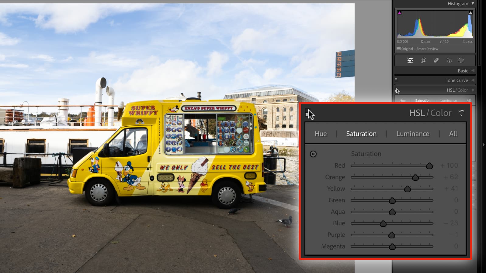
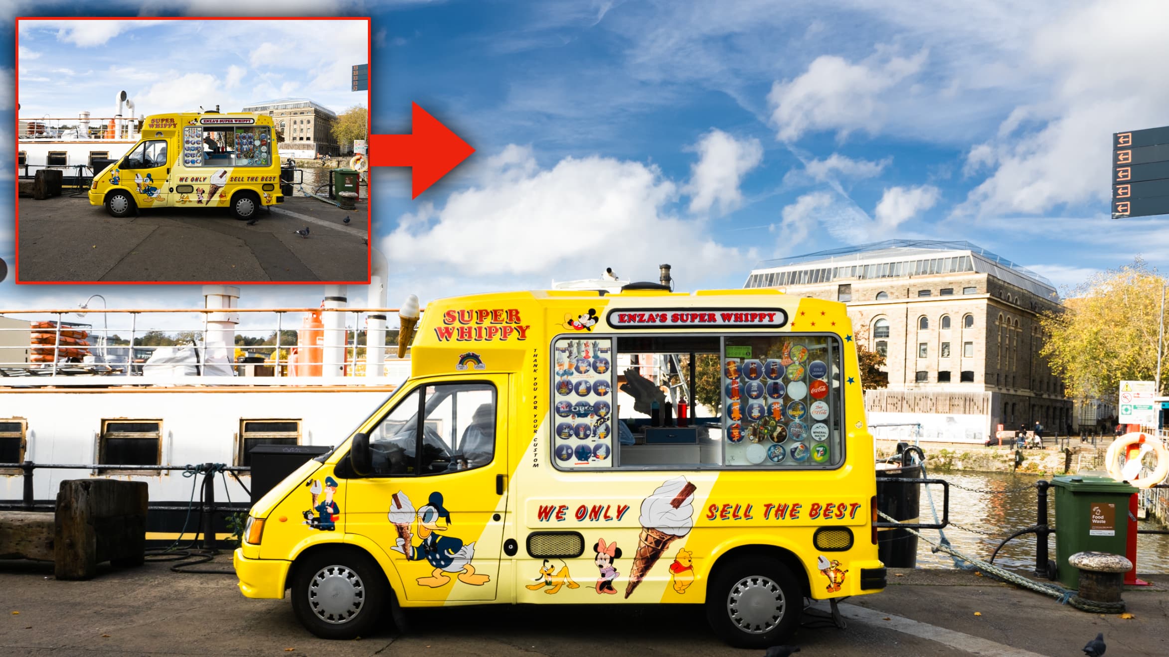
That’s certainly the case for my dockside street shot, which I think needed a dose of Martin Parr style hyper-color rather than the very neutral rendering captured by the camera (though it was early winter, not summertime).
To a degree you CAN achieve this in-camera with ‘Vivid’ picture styles or similar, but these affect all colors at once and increase the contrast too. They go too far and not far enough at the same time.
Article continues belowAnd if you hike the Saturation in software, again its all the colours at once, and while Vibrance theoretically targets weaker colors most, that can look wrong too. I’m much happier with my ‘end’ shot above because I’ve been able to make the rich blue sky and bright yellow van contrast in exactly the way I wanted to.
It’s much better to take control of colors individually. That way, you can control their strength and brightness without affecting the others, and you can create and control color contrast in ways that you don’t get with simple Saturation and Vibrance adjustments.
Best of all, you don’t need any masks. Just as well, really, because Lightroom’s simplified local adjustments don’t include these HSL tools.
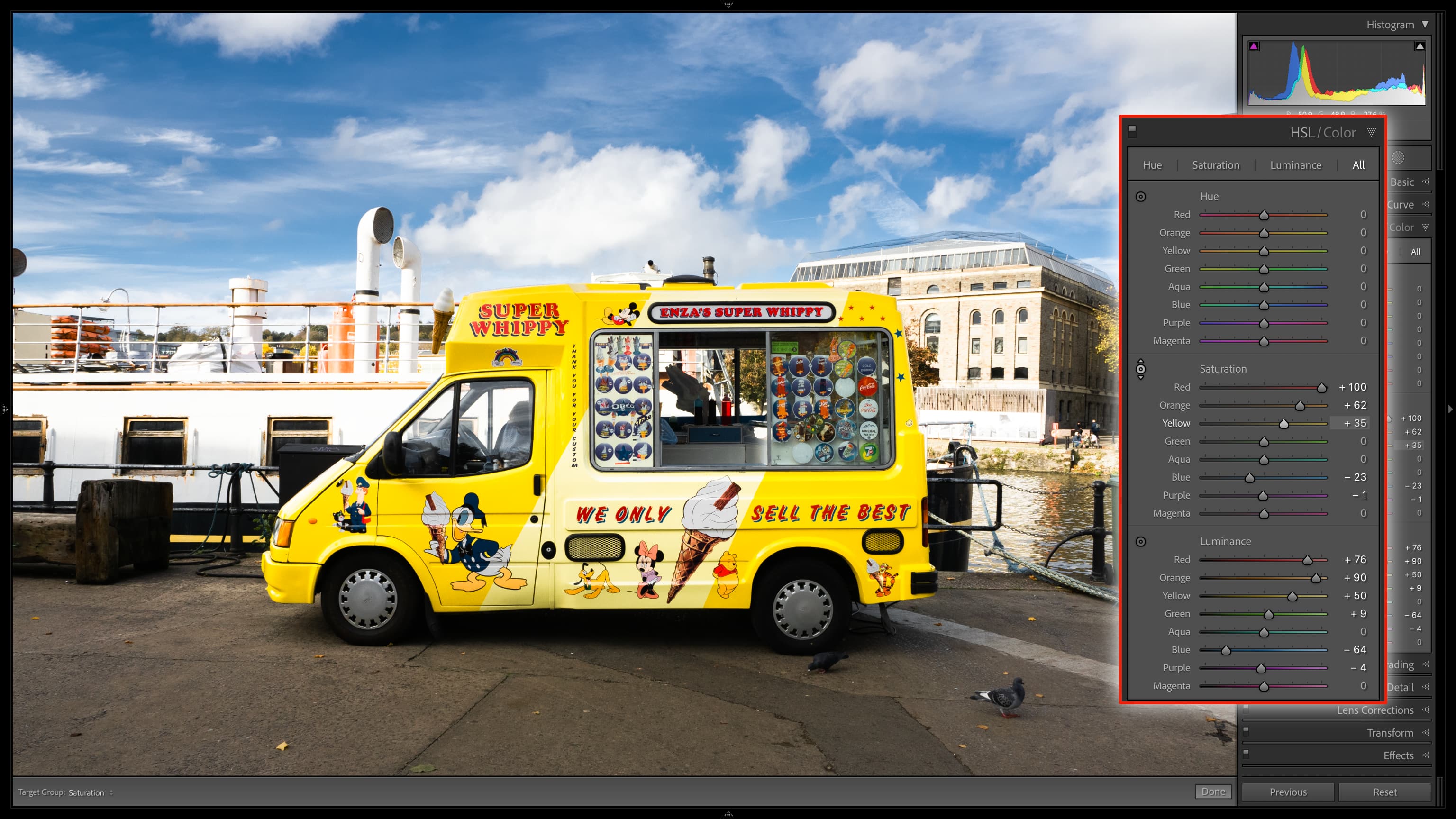
I’ve blown up the HSL panel so that you can see the controls. There are sections for Hue, Saturation and Luminance, and if you select the little round targeted adjustment gadget in the top left of the panel, you can drag up and down in the image on the sky, for example, to change whichever of those three parameters you need to.
The best camera deals, reviews, product advice, and unmissable photography news, direct to your inbox!
The interplay between Hue, Saturation and Luminance can seem complex at first, but you soon pick up on a few key combinations that work. When I reduced the Luminance of the sky, for example, I also had to reduce the Saturation to keep it looking half-realistic. I also increased the Luminance of the yellows in the ice cream van, but making colors lighter reduces their saturation, so I had to give that a boost too.
Read more:
• Best photo editing software
• Lightroom review
• Lightroom Classic review
Rod is an independent photography journalist and editor, and a long-standing Digital Camera World contributor, having previously worked as Group Reviews Editor, Head of Testing for the photography division, Technique Editor on N-Photo, and Camera Channel editor on TechRadar, as well as contributing to many other publications.
He has been writing about digital cameras since they first appeared, and before that began his career writing about film photography. He has used and reviewed practically every interchangeable lens camera launched in the past 20 years, from entry-level DSLRs to medium format cameras.
Rod has his own camera gear blog at fotovolo.com but also writes about photo-editing applications and techniques at lifeafterphotoshop.com.
