Color photography masterclass: Part 1
Get to grips with essential color relationships and create images with superior impact
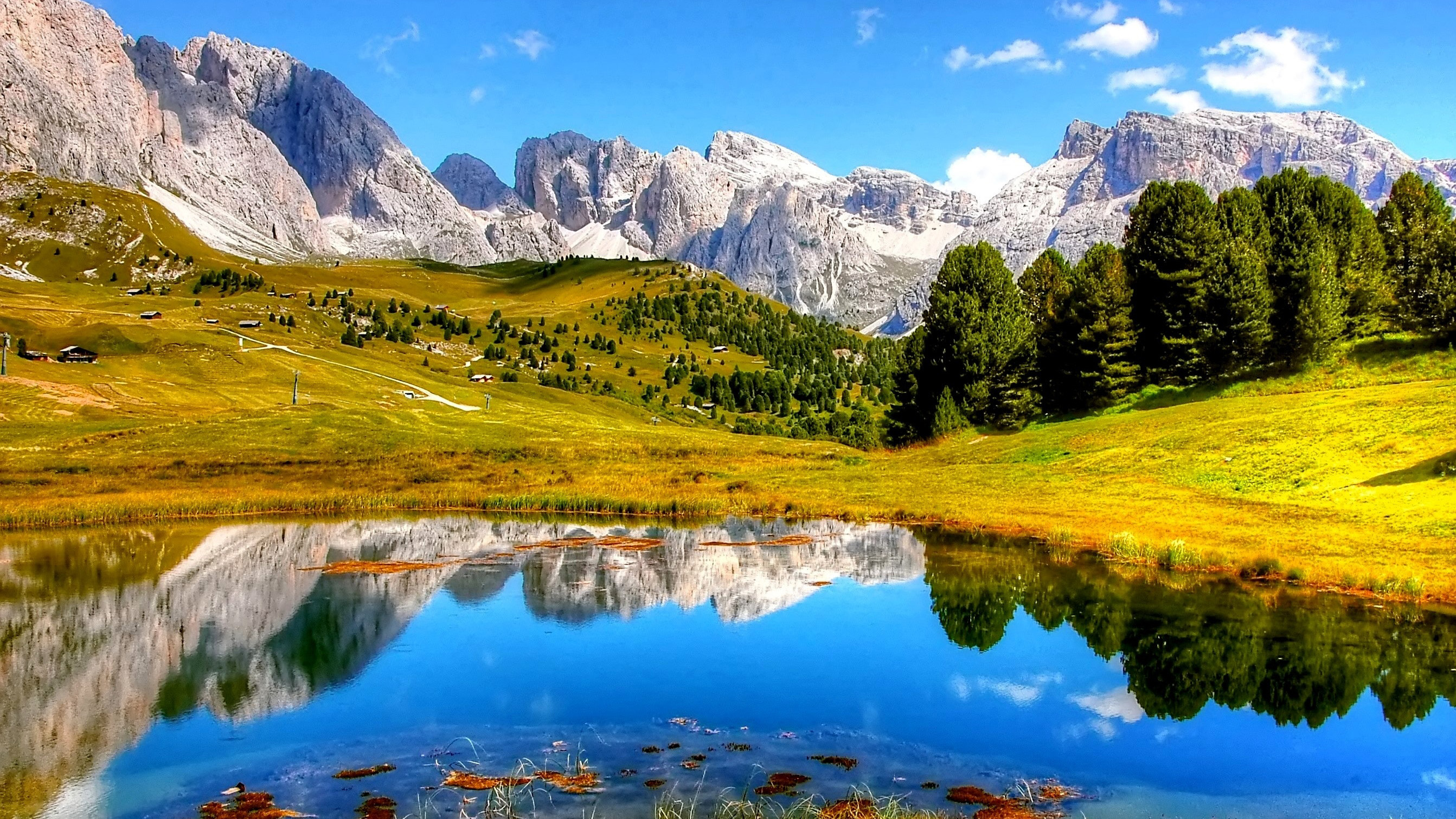
Color is second only to light itself when discussing the core elements of photography. The advent of color imaging revolutionized the medium, since the capture of the colors available in the natural world is the aspect which truly sets it apart from any other art form. While black and white images have tremendous narrative properties, color reproduction is the most honest way we have to record the world around us. It goes without saying therefore that, as advanced photographers, it is essential that we understand the best ways of shooting natural hues.
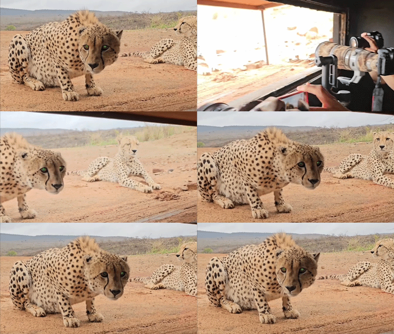
While sometimes color can be interpreted creatively, for dramatic effect, for many subjects there is little scope for misrepresentation of colours, before the image starts to look false and uncomfortable. Portraiture is a perfect example of this - skin tones must be carefully recreated or the person in the image no longer looks human! For most sittings this is far from the ideal effect. Similarly with wildlife and certain landscapes it is critical that colors are exactly reproduced. Fresh natural colors which experience a noticeable hue shift look drab and sickly, which can ruin an otherwise stunning scene. Likewise, when recording animals, it is vital to capture the true colors of their markings, for later identification.
In our masterclass this issue we delve into the theory and practical application of color harmony, as well as exploring how to capture beautiful, realistic colors in-camera and at the computer.
Color theory
Painters and interior decorators are all too familiar with colour relationships since these play a critical part in the success of a design or painting. However, while photographers work with color as much as any other art form, we so often forget to recognize chromatic interactions in our images. We tend to become preoccupied by sharpness, exposure effects and overall color intensity that we pay less attention to how each color works all of the others present.
Read more: Color editing essentials
This can create issues that are overlooked, most often on a local, image zone specific basis. We will often select a composition based solely on the subject matter and will either shoot at whatever time of day it happens to be, or choose to revisit the location during the golden hours - the favorite time for soft, warm lighting. While this can produce highly attractive images as standard, it is important to be mindful of what is in your image and how the color of each object or area relates to the color bias of the light.
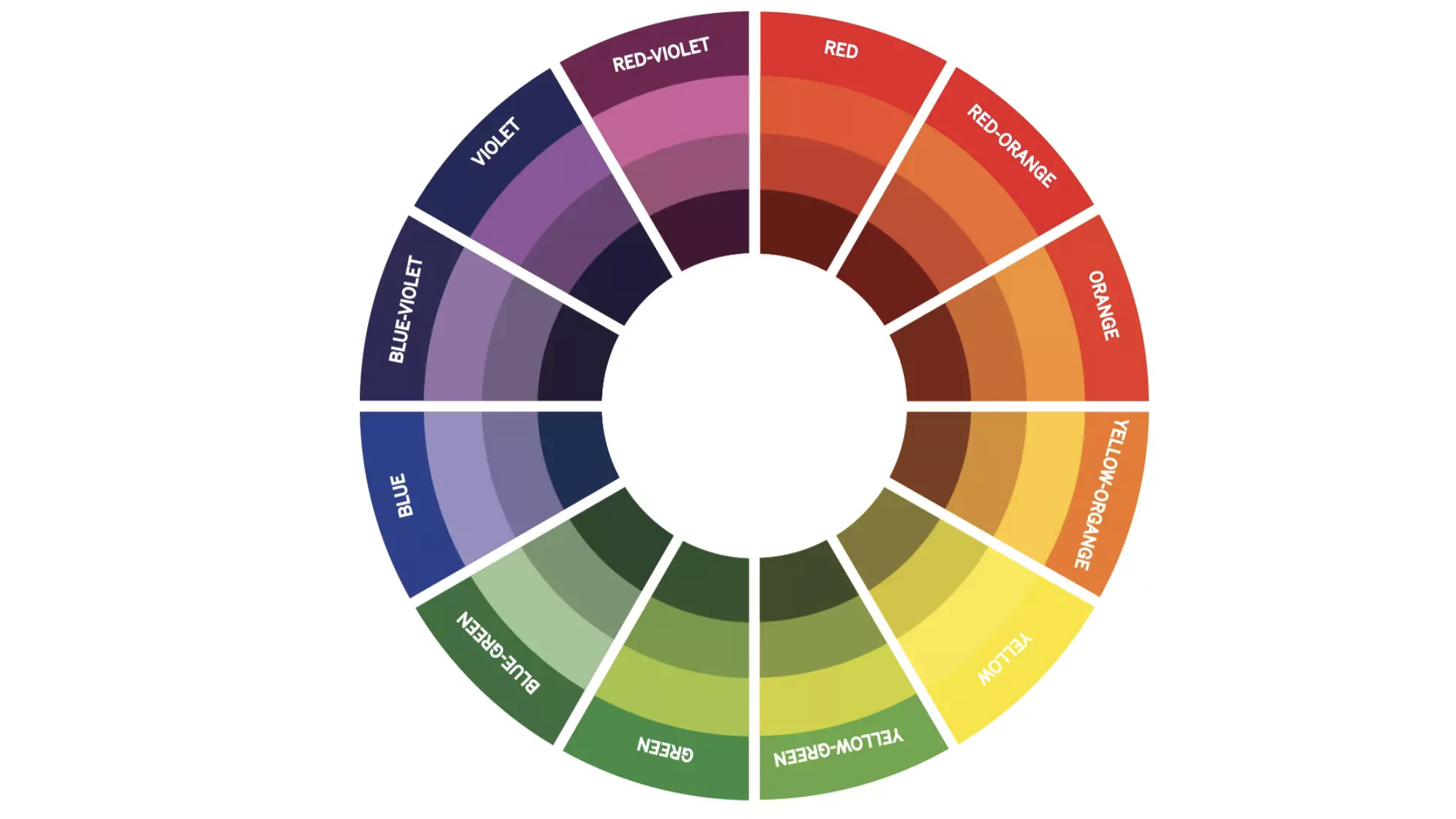
Generally speaking complimentary colors are seen as appealing combinations because they provide contrast which is eye catching, but not overpowering. Meanwhile colors which are closer on the color wheel can be either restful or underwhelming, depending on the circumstances of your image and the depth you are attempting to convey. If used poorly any combination of colors can spoil an image by becoming the most noticeable element of an image, instead of guiding the eye of the viewer to the part of the image that is the main subject.
The best camera deals, reviews, product advice, and unmissable photography news, direct to your inbox!
Complementary colors
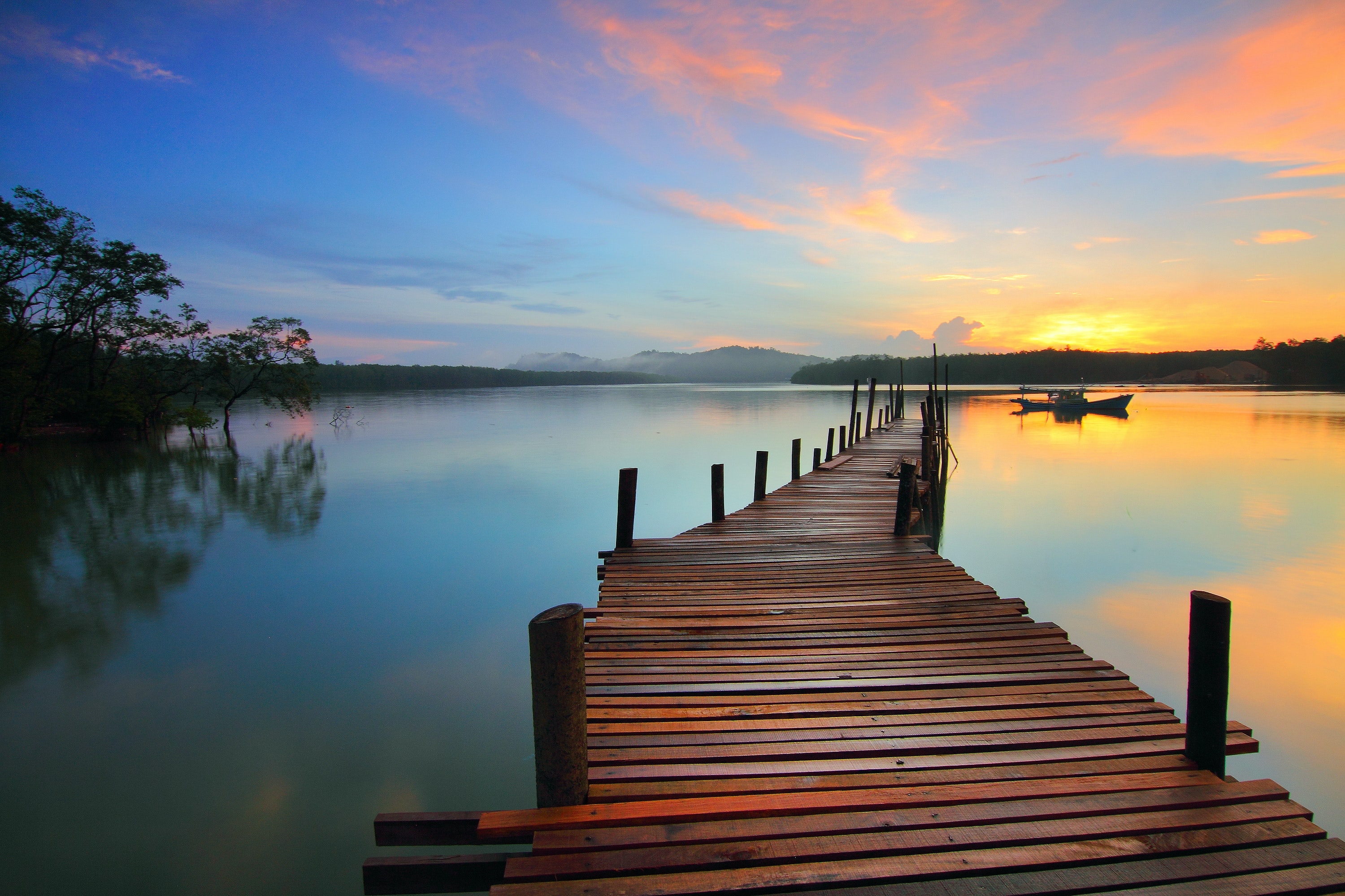
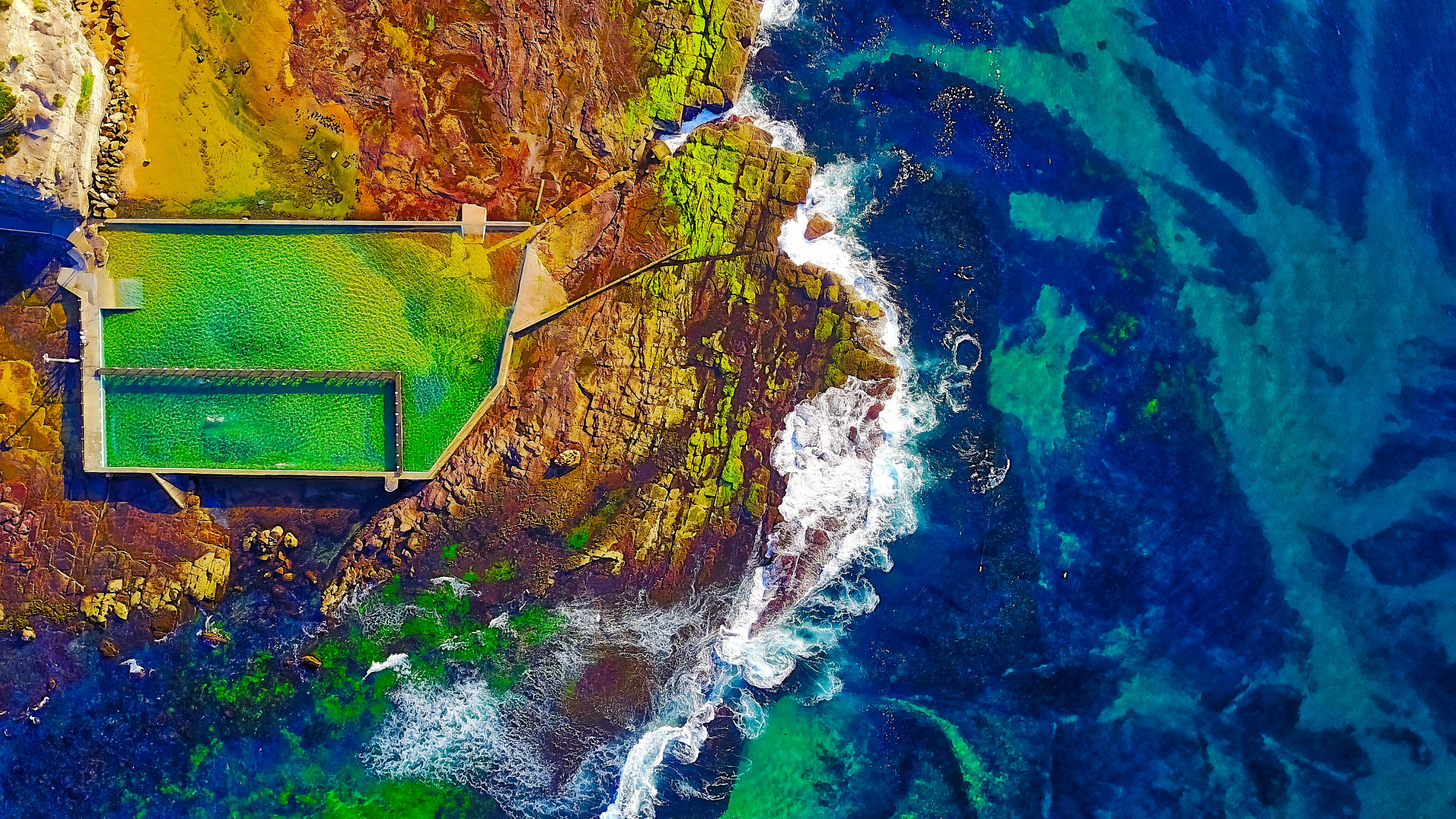
Complementary colors are opposite each other on the color wheel and contrast strongly. When present in close proximity complementary colors will cause each other to stand out, which can provide impact. This is especially useful for providing colour depth, such as cooler shadows to contrast with warm sky tones.
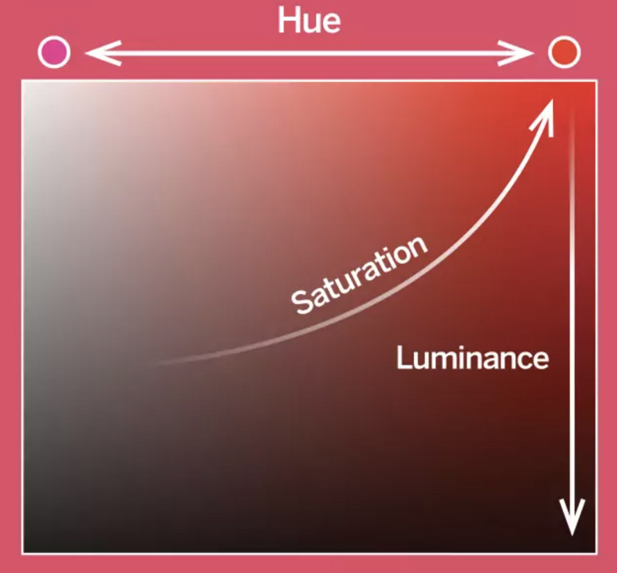
While we might all be familiar with the HSL (Hue, Saturation, Luminance) control in Photoshop most of us are likely unfamiliar with the meaning of each term. Saturation is the amount of grey present in a color, affecting its intensity. Meanwhile hue is the actual base color and luminance is the balance of white and black present - the brightness of the colour. Altering luminance can give the impression of saturation changes, which is why a slightly underexposed shot can appear to have more saturated colors.
Monochromatic colors
This is where several shades of the same color or very similar color appear together. They are ideal for capturing layers in the landscape on a frosty, blue morning or fiery sunset for example. Contrast is low, so images can be tranquil and harmonious but lack depth if used incorrectly.
Analogous colors
These appear next to each other on the color wheel and it is overuse of these which can produce flat looking images, at sunset for example, where the entire image is washed with a warm bias. Avoid these by selecting a more ‘intermediate’ white balance, such as Daylight, rather than Shade or Fluorescent to effectively push a color theme as is the case in this image.
Read Color Photography Masterclass: Part 2
Read Color Photography Masterclass: Part 3
Read more
The best monitor calibrators in 2021: keep your on-screen colors accurate
How to color calibrate your monitor with a Datacolor SpyderX
Digital Photographer is the ultimate monthly photography magazine for enthusiasts and pros in today’s digital marketplace.
Every issue readers are treated to interviews with leading expert photographers, cutting-edge imagery, practical shooting advice and the very latest high-end digital news and equipment reviews. The team includes seasoned journalists and passionate photographers such as the Editor Peter Fenech, who are well positioned to bring you authoritative reviews and tutorials on cameras, lenses, lighting, gimbals and more.
Whether you’re a part-time amateur or a full-time pro, Digital Photographer aims to challenge, motivate and inspire you to take your best shot and get the most out of your kit, whether you’re a hobbyist or a seasoned shooter.

