How to improve greyscale tones
Selectively lighten or darken greyscale tones in easy steps
The best camera deals, reviews, product advice, and unmissable photography news, direct to your inbox!
You are now subscribed
Your newsletter sign-up was successful
DOWNLOAD TO YOUR COMPUTER FROM: http://downloads.photoplusmag.com/pp123.zip
Improve the look of a monochrome conversion
Time needed: 15 minutes
Skill level: Beginner
Kit needed: Lightroom 5 or later
In the days of shooting with black-and-white film, photographers would place a coloured filter over the camera’s lens to produce more striking pictures. Different coloured filters lighten or darken the greyscale tones of specific objects in the scene. For example, a red filter makes blue skies appear dark grey in the monochrome print, so lighter clouds pop out in contrast.
Your camera’s Monochrome picture style setting enables you to produce a black-and-white photo in-camera. You can even set it to apply colour filters that help lighten or darken greyscale tones in particular areas, such as blue skies or green fields. This in-camera approach can be hit and miss, so we’ll show you how to take more control of greyscale tones in your monochrome conversions in Lightroom.
Article continues belowThere are several ways to create a monochrome image in Lightroom. If you simply set Saturation to 0, you’ll get an instant mono conversion, but you risk producing a drab wash of greys, especially if the shot consists mostly of mid-tones. An eye-catching monochrome photo has a wide range of tones, from black shadows to white highlights. Let’s see how to get better black-and-white images…
STEP BY STEP: Soft silver tones
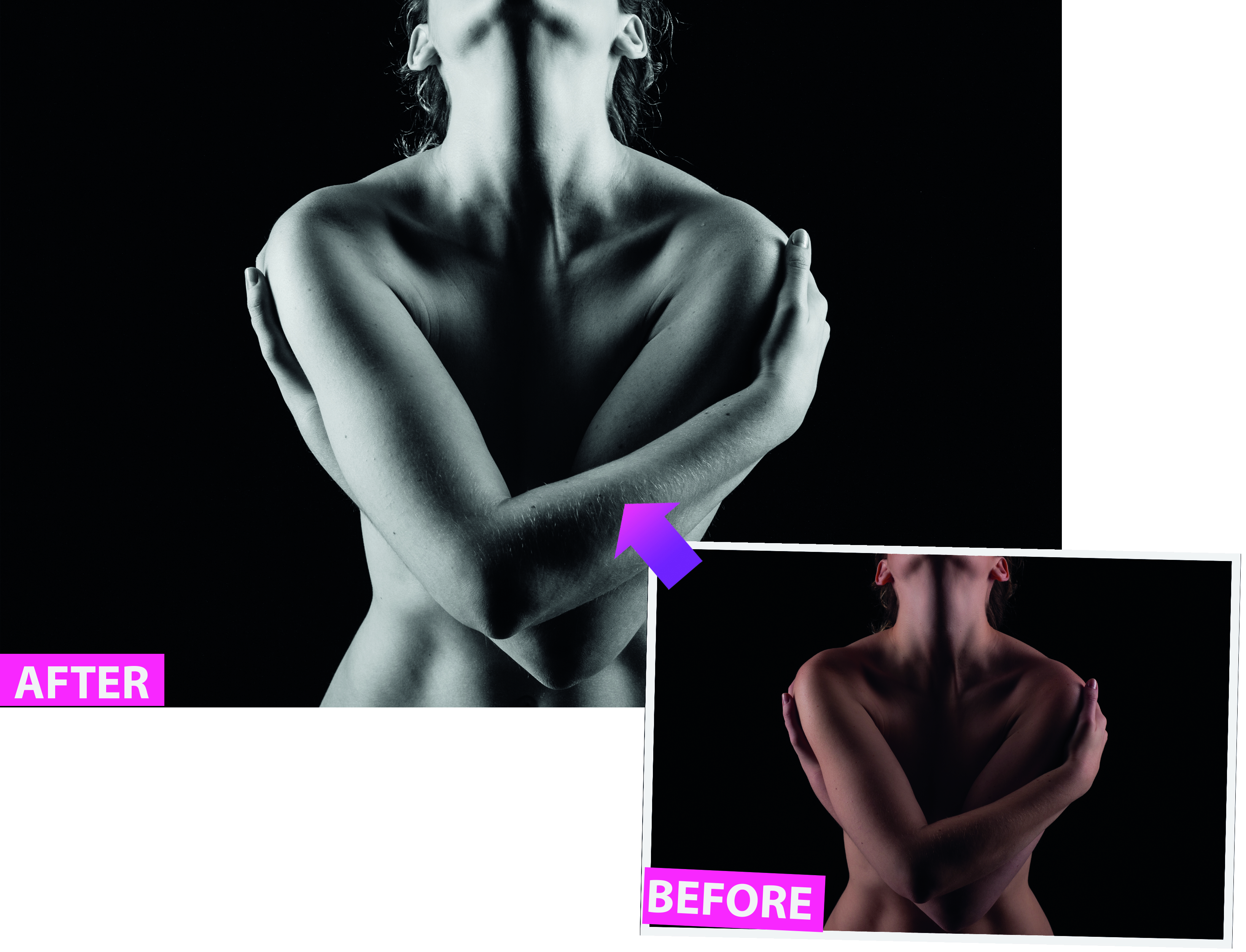
Create a monochrome image that packs some punch with our simple walkthrough
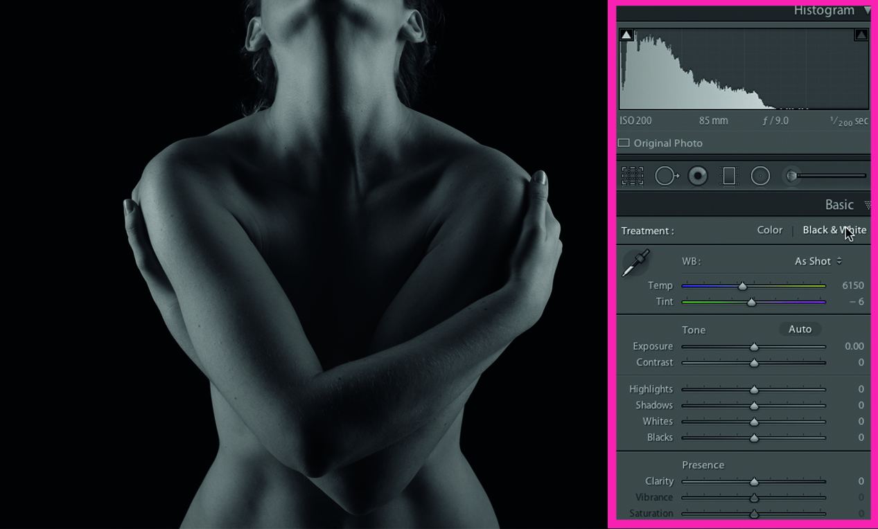
It’s still handy to set the Monochrome picture style in-camera to give you an idea of how your shot will convert to black and white
01 GO GREY
Import TYLR01.dng. In the Basic panel’s Develop module, click on the Black & White tab to desaturate the photo. Lightroom adjusts the position of the Black & White mix sliders. You can fine-tune the results. Drag Orange up to +33 to lighten the skin tones.
The best camera deals, reviews, product advice, and unmissable photography news, direct to your inbox!
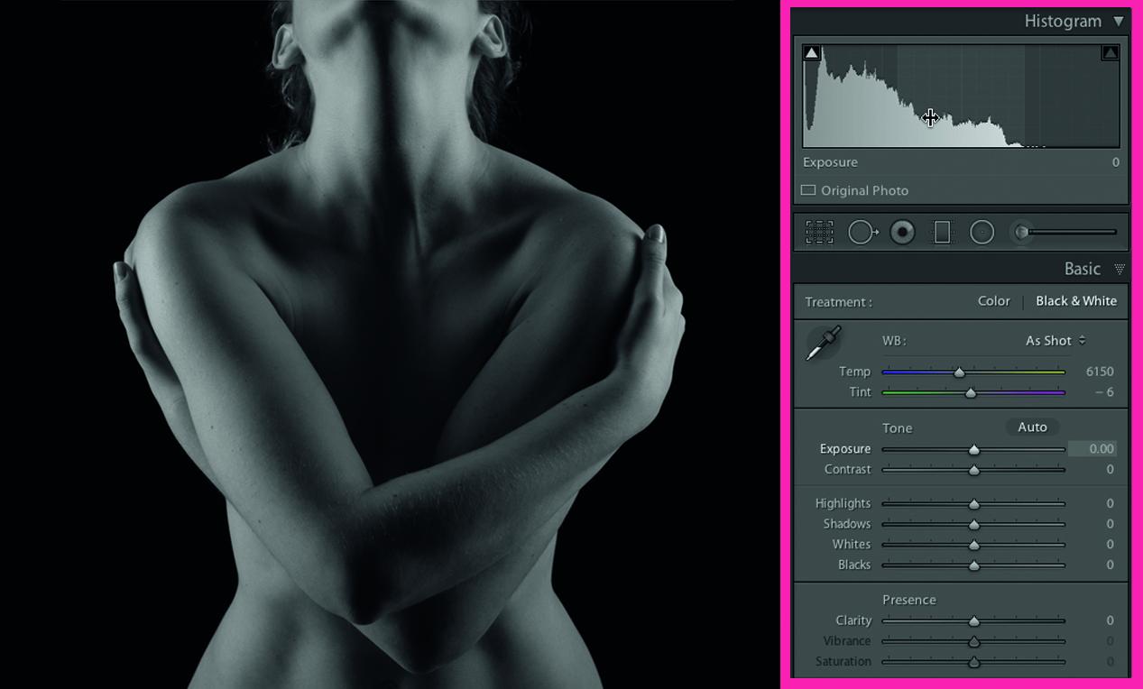
02 A QUESTION OF CONTRAST
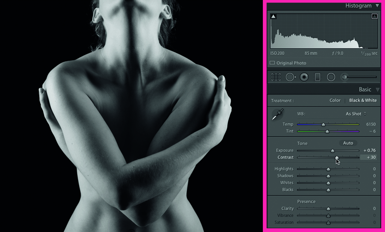
After lightening greyscale tones that correspond to orange colours, the histogram has slid to the right. However, you still need to boost the contrast. If you move the cursor over the middle of the graph you’ll see that the Exposure slider influences this section.
03 INCREASE THE EXPOSURE
Click on the middle of the histogram and drag right to push exposure to +0.76 (or drag the Exposure slider right). Increase the strength of the tones by pushing the Contrast slider to +28. The higher-contrast photo has more impact and a healthier-looking histogram.
04 LIGHTEN THE SHADOWS
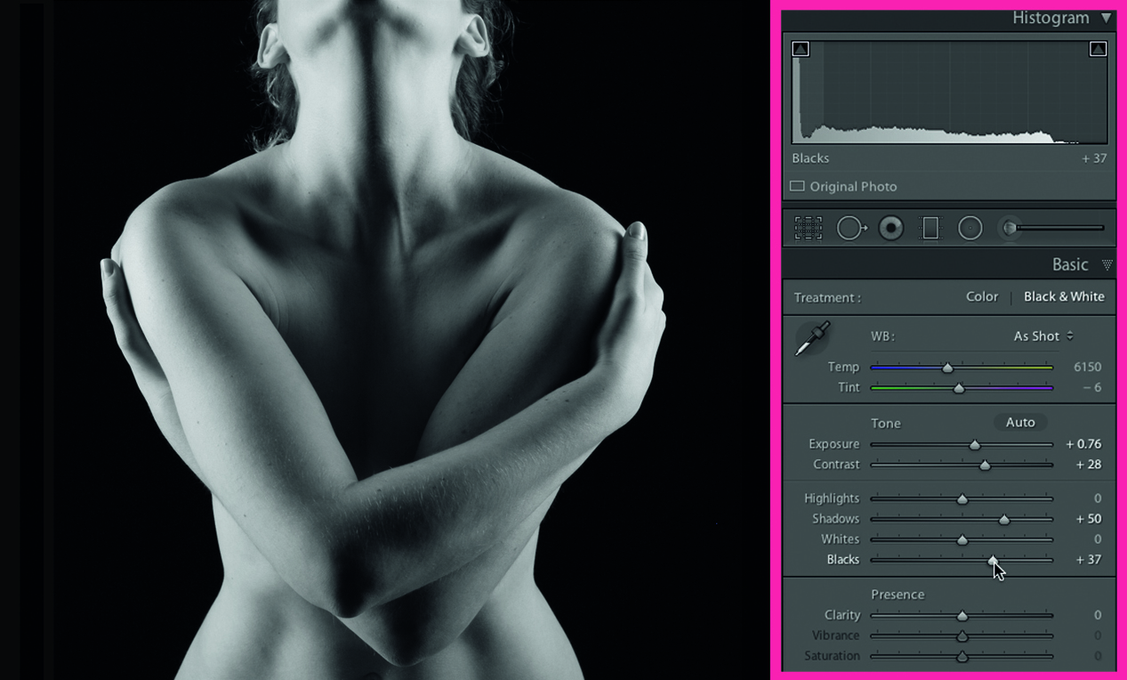
Click on the histogram’s Shadow Clipping Warning icon. Areas that will print as pure black will appear as blue patches. There’s no clipping, but some shadows lack detail. Push the Shadows slider up to +50. Reveal more detail by dragging the Blacks slider to +37.
05 BOOST THE CONTRAST
To reveal the form of our fine-art nude, we can push the contrast even further. The Tone Curve tab enables you to selectively lighten or darken tones in a variety of ways (see right), but for now simply click on the Point Curve drop-down menu and choose Strong Contrast.
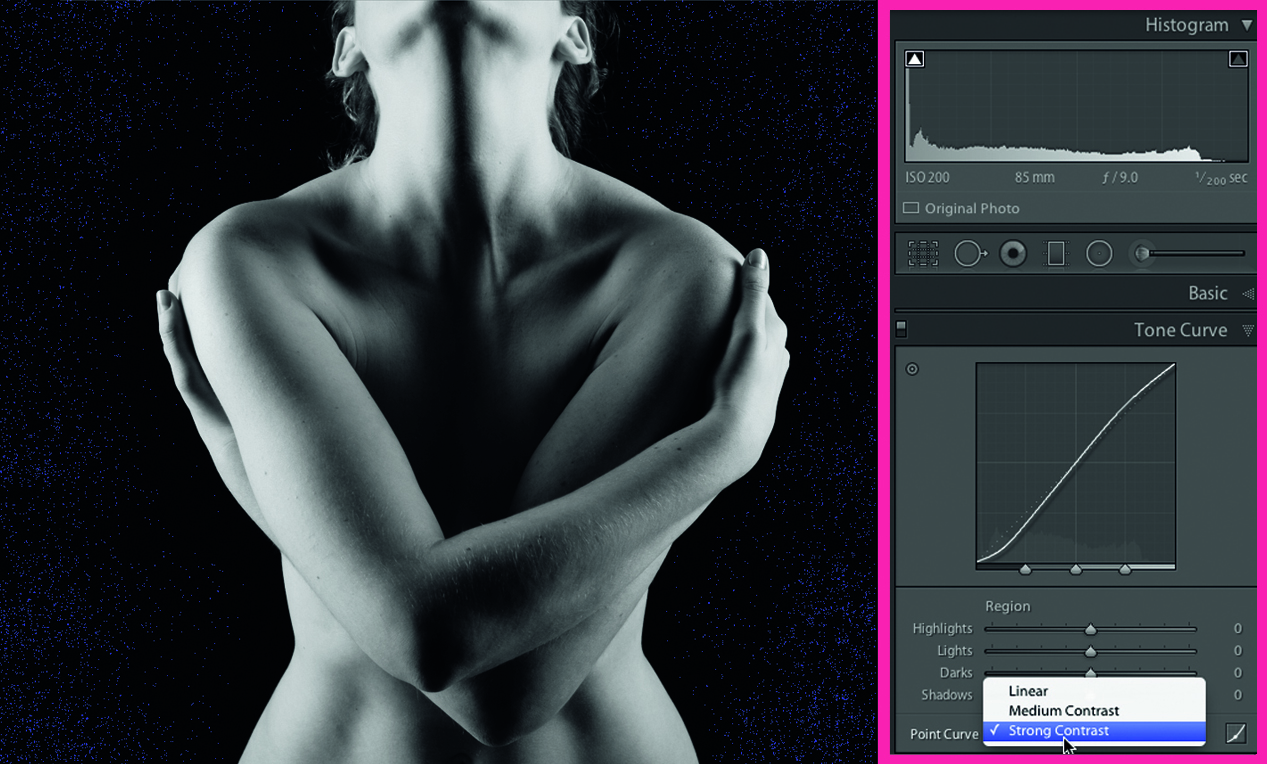
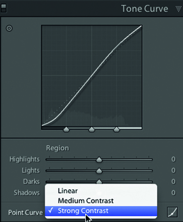
Lightroom’s Tone Curve tab enables you to target tones and remap them to make them lighter or darker, displaying the results on a graph. We’ve selected the Strong Contrast preset, which gives a classic ‘S-shaped’ graph by decreasing Shadows and Darks and increasing Highlights and Lights. You could also manually drag the sliders that appear below the graph, or click-drag on the graph itself, moving your mouse up or down to increase or decrease the tones in that particular area.
06 FINE-TUNE THE GREYS
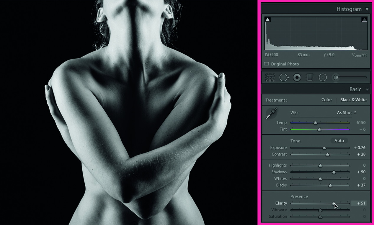
This contrast boost reintroduces some background clipping, but there are no important details here. Go back to the B&W tab to fine-tune the conversion. Push Reds up to +40. Return to the Basic panel and go to the Presence section. Drag the Clarity slider up to +51.
George has been freelancing as a photo fixing and creative tutorial writer since 2002, working for award winning titles such as Digital Camera, PhotoPlus, N-Photo and Practical Photoshop. He's expert in communicating the ins and outs of Photoshop and Lightroom, as well as producing video production tutorials on Final Cut Pro and iMovie for magazines such as iCreate and Mac Format. He also produces regular and exclusive Photoshop CC tutorials for his YouTube channel.

